Get Inspiration for Your Office With These Beautiful Acrylic Signs
Maybe you're moving into a new office, or maybe you're looking around the office you've been in for quite some time and things look a little stale. A great way to give your office space a special feel is by including some interior signage.
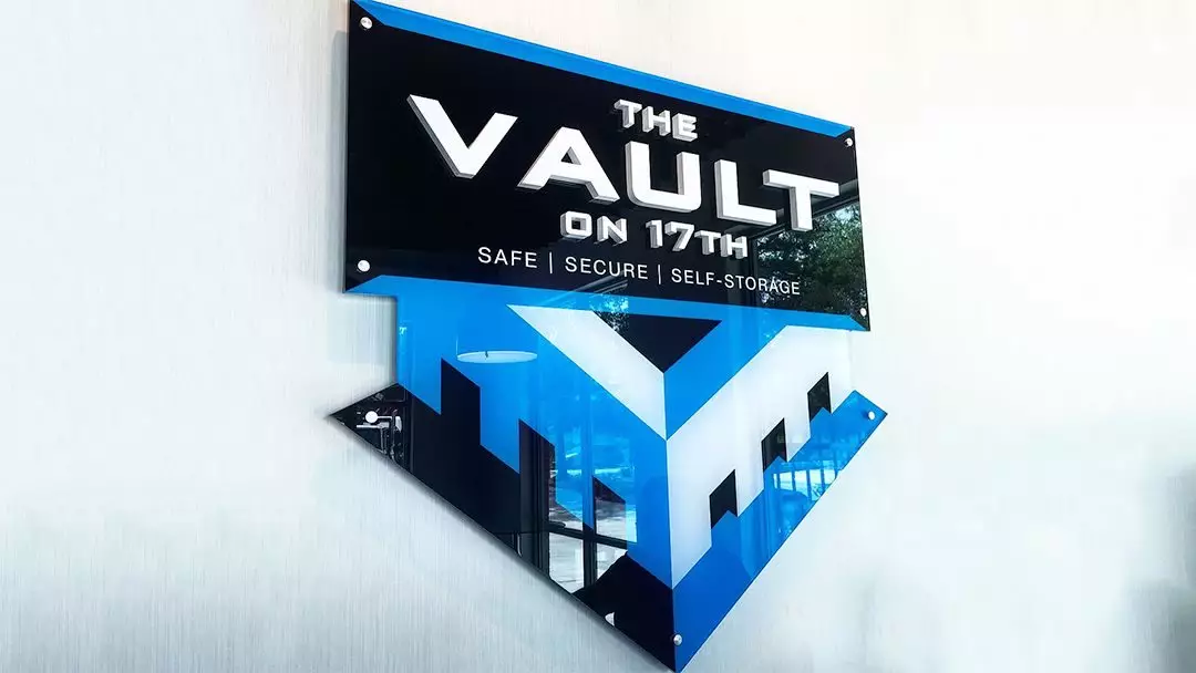
There's a wide range of possibilities when it comes to acrylic signs: the signs can be all acrylic, use an acrylic backer, or use acrylic letters with a different material for the backer. One of the more popular choices because of how sharp it looks is acrylic when mixed with brushed aluminum. Let's dig in and take a look at some pieces we've made to provide some inspiration.
Acrylic with Printed Letters
Looking for something that classes up your space, can be easily moved, and is cost-effective? Look no further than an acrylic back with printed letters. Below you can see an example of a frosted acrylic back with printed letters and then mounted using aluminum standoffs that both make it stand out from the wall and easy to move in the future.

These signs at Cape Fear Community College's Wilson Center honor donors in an eye-catching and beautiful way. They are all flat acrylic signs, mounted with standoffs and accentuated with CFCC logos.


WWAY wanted to mimic etched glass. We created an acrylic sign for them that features frosted/etched media and looks brilliant in their space.

Dimensional Acrylic Signs
Another great look is to add some dimensional acrylic letters to an acrylic backing. The first example, from Go Property Management is somewhat similar to the Community Foundation of NC East sign above except instead of printed letters, now there are black acrylic dimensional letters.

We created a beautiful dimensional acrylic sign for Intracoastal Realty that uses a black acrylic back along with a brushed aluminum dimensional logo and dimensional letters. The colors in the logo are printed on the brushed aluminum. It meshes beautifully with the aluminum standoffs for an eye-catching look.

A somewhat similar sign was designed for the Lanier Property Group. This square sign also features a black acrylic back with brushed aluminum-faced acrylic dimensional letters to make up their logo.

One Belle Bakery makes some of the finest treats in town and wanted a sign to stand out upon entering the shop. This sign features a frosted acrylic back with rounded corners and brushed aluminum-faced acrylic dimensional letters and painted teal acrylic for match the pantone colors of their logo perfectly.

The sign for Salling & Tate combines multiple techniques. This stunning sign features a clear acrylic backing with white and brushed aluminum-faced dimensional letters followed by printed letters. The dimensional letters pull your eye to them and emphasize the name of the company.

Tidal Wellness’ sign follows a similar style with both dimensional acrylic letters and printed text to match the company’s Pantone colors exactly .. on the acrylic backing combined with rounded corners. The dimensional letters are brushed-aluminum faced-acrylic and pop against the frosted background.


We created a sign for Wilmington Periodontics & Implant Center that features both acrylic dimensional letters and a dimensional logo against a clear acrylic backing. It looks great in their office! You can see in the below pictures both the final product and the sign as it's being created.


This acrylic and aluminum sign in the Pine Valley Baptist Cafe looks stunning against the bright wall color. It consists of a brushed aluminum backing with flat white cut vinyl on the top and bottom, and white acrylic dimensional lettering and logo. Since the logo extends beyond the backing, it has four dimensions of depth to it: the wall, the backing, the printed lettering, and finally the logo and “CAFE” lettering. We think it looks great!


Acrylic Lettering Only
Acrylic signs don’t always need a backing material. Using the wall as the background can look absolutely stunning, as is the case with this Swain & Associates sign. These letters are fabricated out of black acrylic faced with brushed aluminum tinted to a dark bronze color. It gives their office an air of sophistication. You can see the detail work on the second image that really makes the dark bronze appearance stand out.


This Robuck Homes sign fits in perfectly with their decor. The letters are actually two different textures of aluminum-faced acrylic. The main letters are a cross-hatch pattern, while “Since 1926” is done in satin aluminum. The edgy look complements the shiplap wall and cottage style of the office.


We hope these examples have inspired your creativity as to what you can expect from an interior sign. The next time you want to add some pizazz to your office, think acrylic! For more details or if you'd like assistance in coming up with some great sign ideas, give us a call at (910) 350-8242. We'll help you take your interior space to the next level with a beautiful acrylic sign.
